
Patient Intake Workspace
Less Time on Records, More Time for Patients
An exploration of what it takes to build an AI product responsibly, applied to a real workflow where the stakes are clinical and the margin for error is low.
Background
As a product designer with a background in complex, heavily regulated health SaaS, I've worked on products where clinicians and patients depend on information being accurate and trackable as it moves through systems. In practice, that process is often painfully tedious and, despite everyone's best efforts, prone to human error.
This project started from wanting to understand whether AI could genuinely reduce that burden and lift the load off over-extended coordinators and patients who repeat themselves just to get the care they need, while making sure the people using it stayed in control of the decisions that are genuinely theirs.
The Problem
When a patient transfers care, someone at the receiving practice has to piece together their history from whatever records show up. Records arrive in inconsistent formats at unpredictable times. The coordinator reconciles everything by hand, often without a reliable way to know what's missing.
When the process breaks down, the provider walks in without the full picture, and the patient ends up filling the gaps herself, repeating a history she assumed had already been handled, at a moment when she was hoping to simply be seen.
Design Principles
Before any research or interface work, I needed to get clear on what it actually means to build an AI product responsibly where the stakes are real.
I developed seven design principles by sitting with what I was learning about how care coordinators think and work, the constraints of a HIPAA-regulated environment, and a framework around trust calibration and knowing when AI should suggest versus act.
Center the patient. Every decision is evaluated against its effect on patient care, even when the direct user is the coordinator
Make AI legible. Confidence, status, and source are always accessible
Hold context across sessions. Re-entry returns the coordinator to exactly where she left off
Separate AI processing from human judgment. The system extracts and organizes; the coordinator decides
Be honest about uncertainty. Limitations are visible, not smoothed over
Speak plainly. Language that sounds like a colleague, not a system
Reduce cognitive load. Calm palette, minimal chrome, only what's needed at each step
Every prototype decision got tested against them.
The Process
Before prototyping I worked through a use case canvas to confirm the problem was scoped correctly and AI was genuinely the right tool. I also stress-tested the design against a set of core questions before writing a single prompt or mapping a flow. What happens when the AI is wrong. How trust gets established over time. From there I researched care coordinator workflows to develop a clearer picture of their mental models, wrote system prompts, and mapped out UX flows.
Use case canvas → · Mental model research → · UX flows →
Mental model research pointed to gap detection and progressive disclosure as essential features that align with how coordinators actually work. On a typically busy day, a coordinator notices missing records based on what she expected to see. An OB record for a pregnant patient, for example. But when something falls outside that frame, it goes undetected. She also works under frequent interruptions and high cognitive load, which shaped the decision to surface information progressively so she never loses her place if she steps away.
The system prompts ended up being the most important design work in the project. They defined what the AI would do and what it would never do. Here's an excerpt from Prompt 1.
View all five system prompts →
Prompt 1 — Extraction & Confidence Scoring
You are a record processor, not a clinical reviewer. You do not interpret findings or assess clinical appropriateness. That belongs to the provider.

Score every data point from 0 to 100 based on how cleanly and reliably you extracted it. Do not inflate scores to avoid flags.

HIGH (85–100)    Clean extraction, single source, no conflicts. Surfaces without a flag.

MEDIUM (60–84)   Some ambiguity. Calm flag with plain-language explanation. One deliberate action required before sign-off.

LOW (0–59)       Significant uncertainty. Prominent flag. Two-step confirmation required.

Medications and reproductive history require elevated review regardless of confidence score. This friction is intentional and permanent.
Writing "intentional and permanent" into the prompt meant the AI could never be configured to skip that step. The friction was a deliberate safety measure, built in from the start.


Key Decisions
The “undesign” process
The first prototype came back fast and had captured almost everything in my documentation. It also had way too much on screen. Every data point labeled, confidence percentages everywhere, flags stacked on flags. I was genuinely impressed by what it assembled. I was also immediately editing it.
Working this way gave me something real to push against, early enough that changing course was easy and efficient. The question shifted from "what should we include" to "is it actually helpful to see this right now?"
Most of what I removed came down to one insight. The coordinator's mental model is tracking and closing, not managing data. She needs to know the state of a chart at a glance and move into detail only where her attention is needed. High-confidence items surface silently. Everything removed was made possible by the full audit trail sitting one click away.
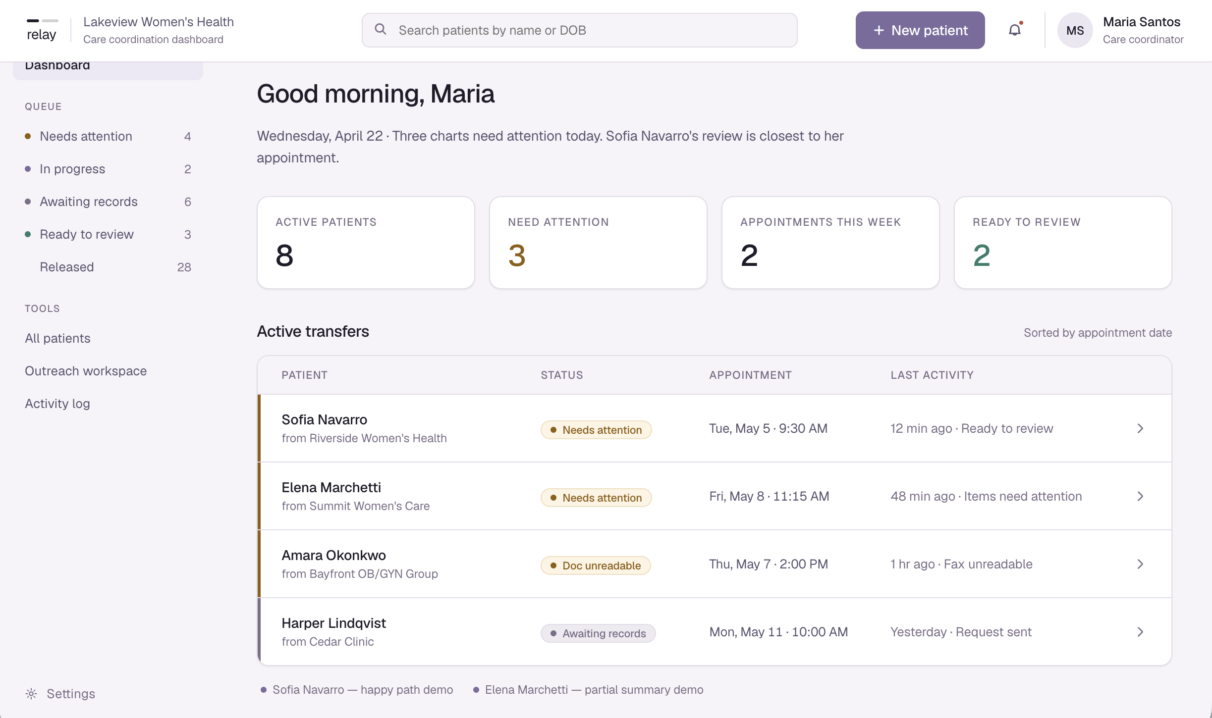
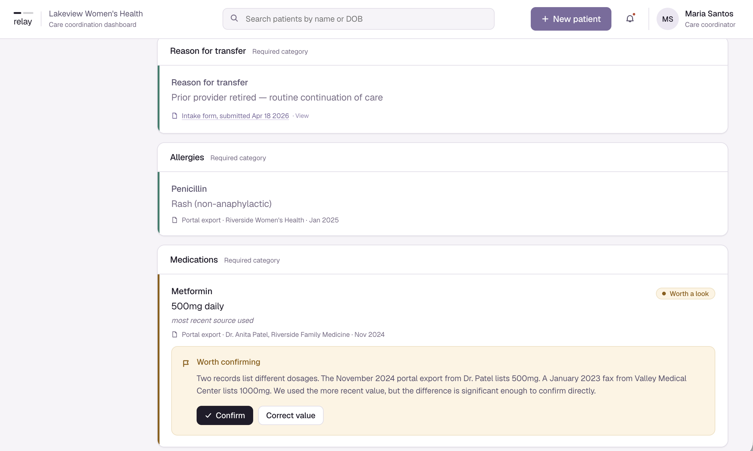
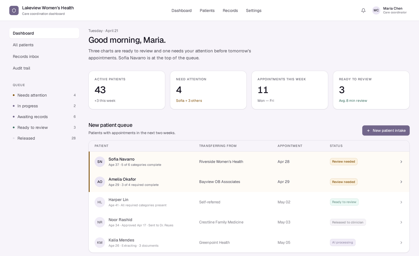
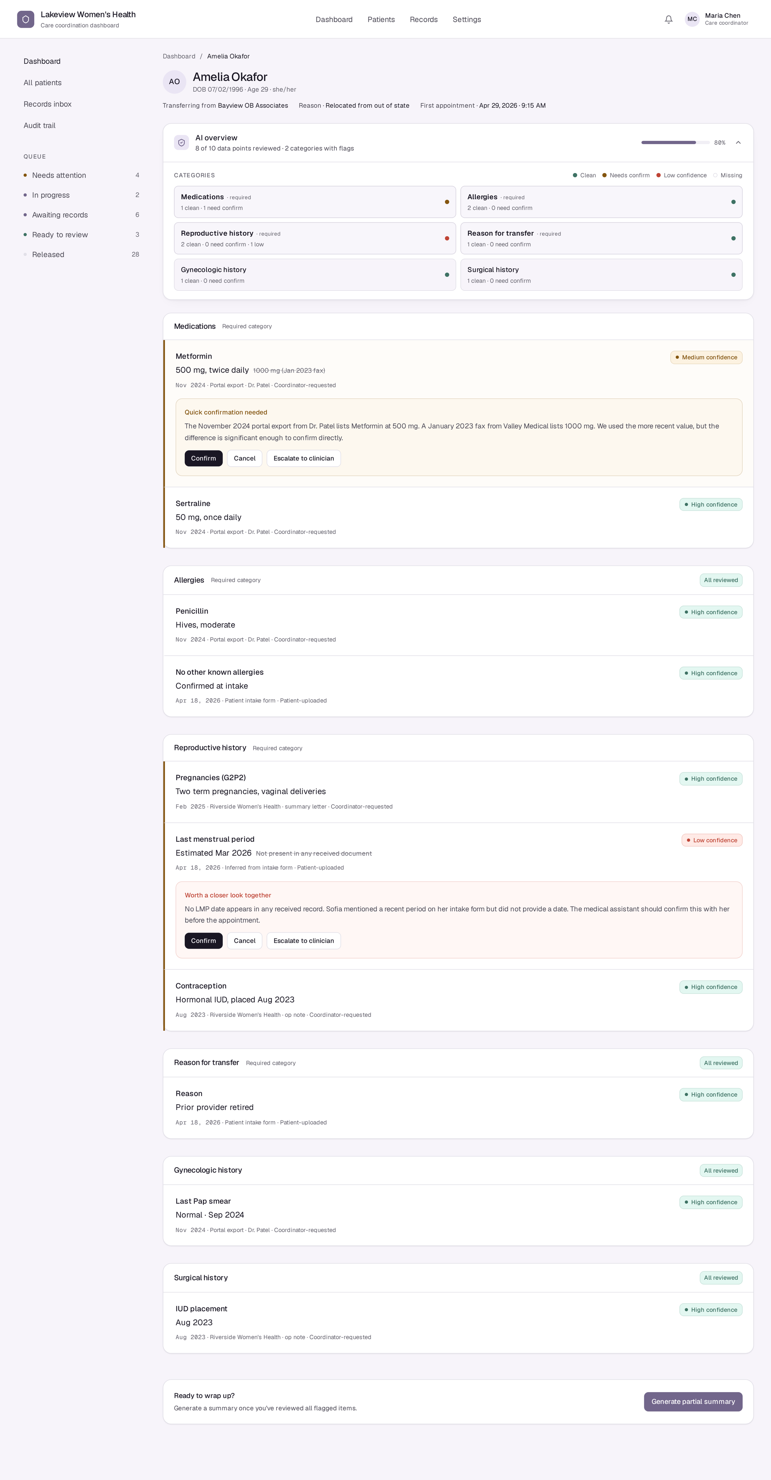
Early version: every item carries a confidence label regardless of whether action is needed. High-confidence items look the same as flagged ones. No clear visual hierarchy tells Maria where to look first.
-
![]()
Proto 1
-
![]()
Final proto 1
-
![]()
Proto 1 inside
-
![]()
Final proto inside


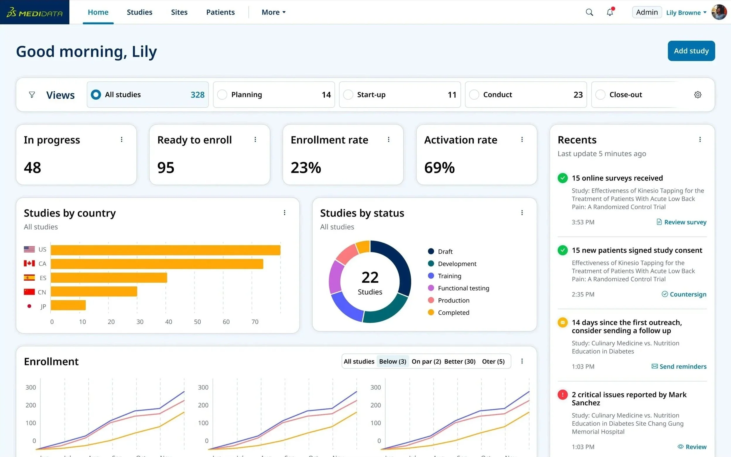
Entry Page Redesign
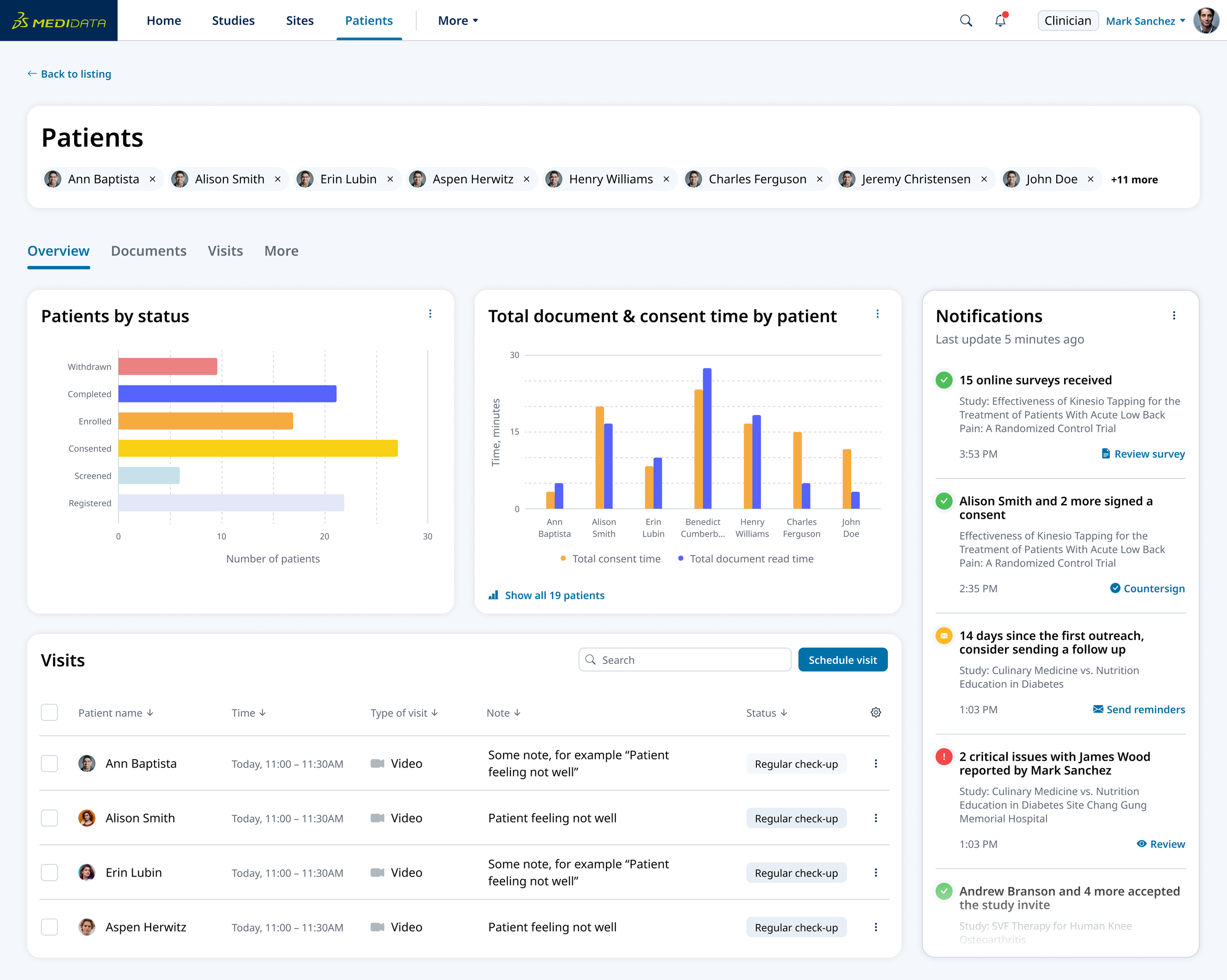
Patients Overview
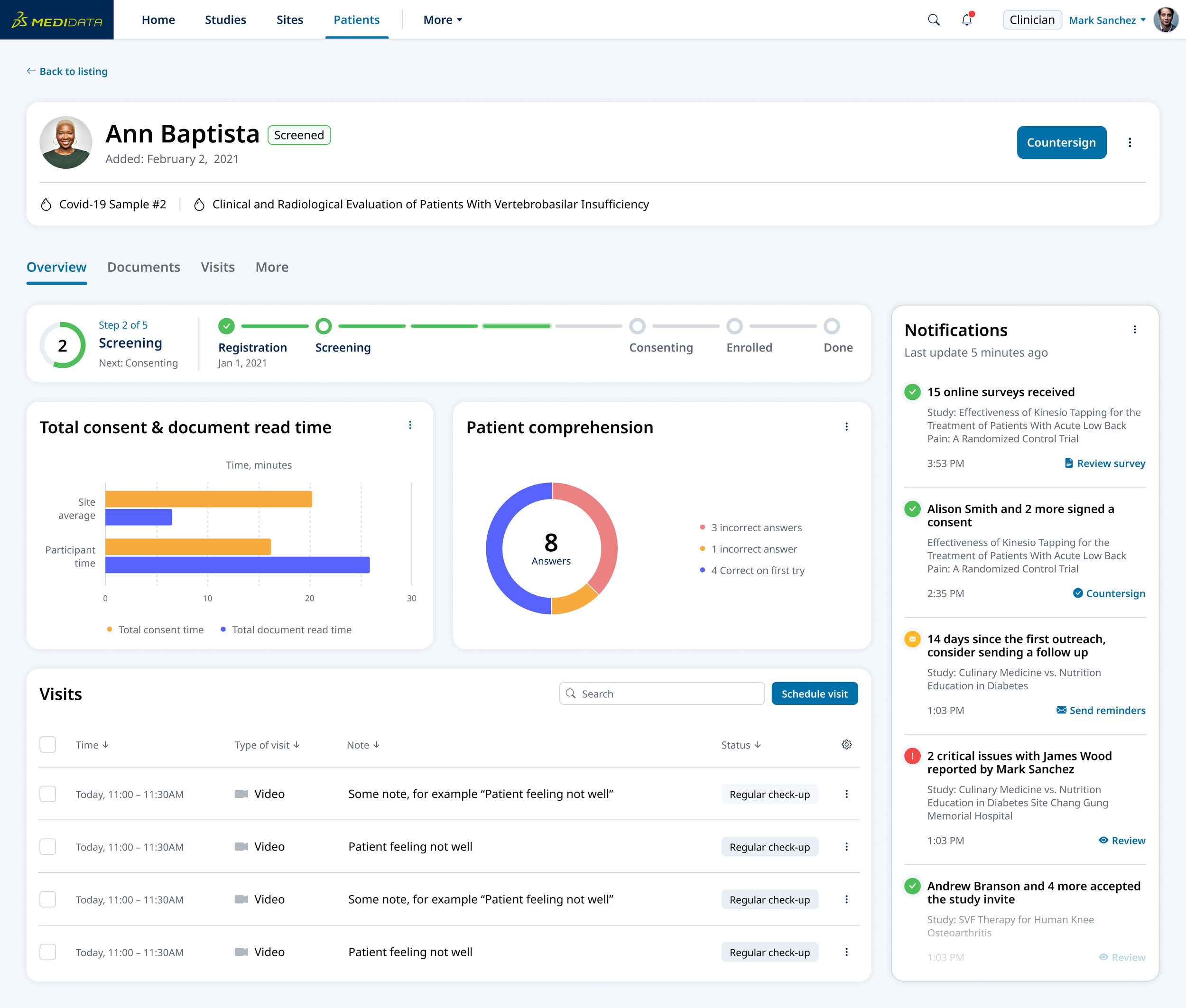
Patient Detail

Clinician View

Study Builder Detail
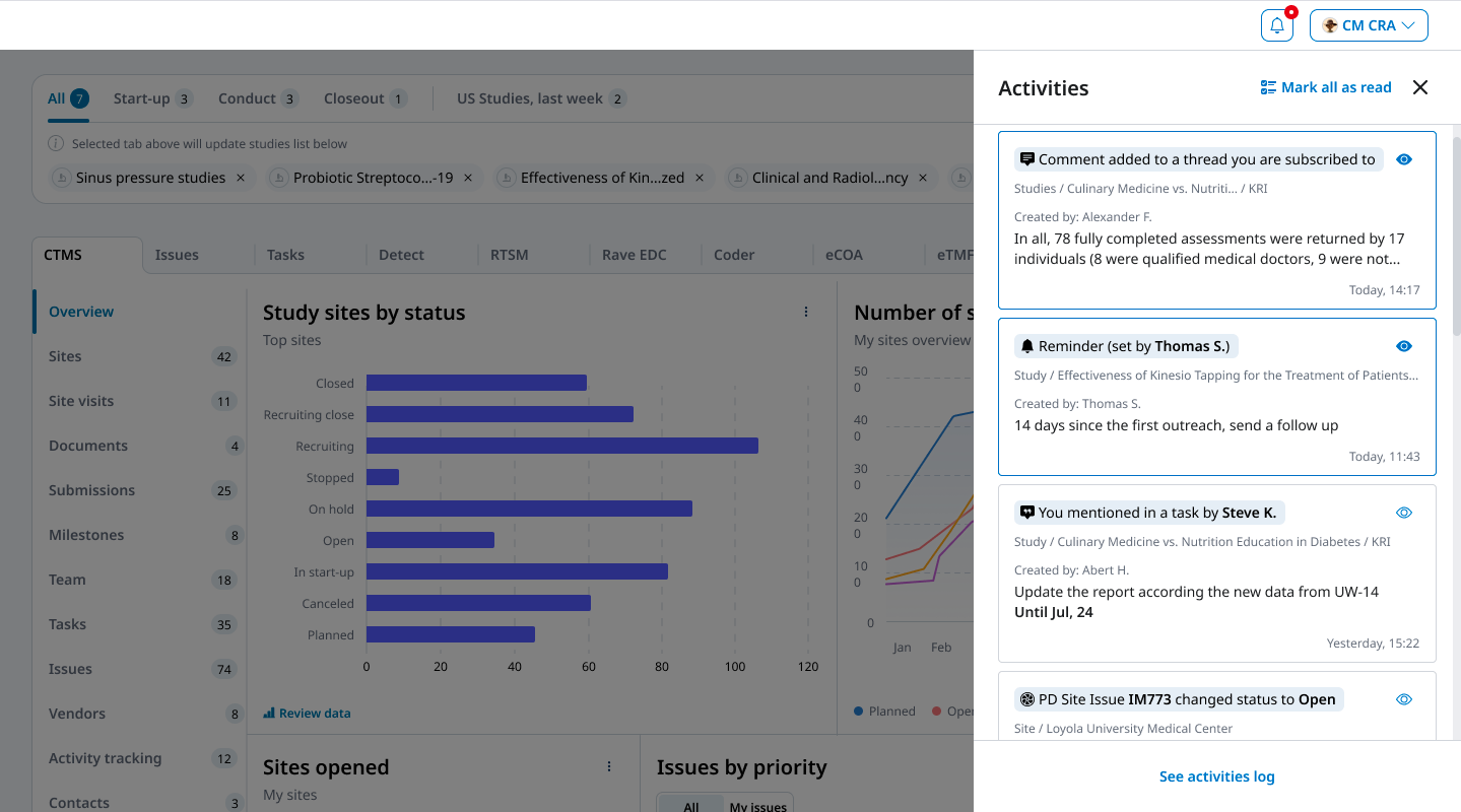
Activities View
Design Outcome
A Unified, Role-Based Dashboard Experience
The initiative culminated in a unified, role-based dashboard that brought coherence and focus to the platform. The design consolidated tools and data into a single entry point where users could view key milestones and take action efficiently.
Major enhancements included:
Role-based dashboard: Personalized views tailored to user type and study context.
Unified navigation: Consistent patterns and labels across all products.
Data visibility: Key metrics and insights surfaced in context to support faster decisions.
Information hierarchy: Simplified layouts that improved readability and reduced cognitive load.
Design system integration: Reusable components and patterns applied consistently across teams.
Accessibility improvements: Enhanced color contrast, typography, and interaction states for compliance and ease of use.
Cross-tool workflow connections: Seamless transitions between related tasks without duplicate setup steps.
Impact
Turning Alignment into Scalable, Inclusive Design
This initiative delivered measurable improvements for users, the business, and internal teams.
For Users
Clearer navigation and consistent patterns
Role-based dashboards surfacing the most relevant data and actionable items
Streamlined workflows that reduced duplicate setup and manual work
For the Business
Faster study builds and more efficient trial execution
A scalable framework for integrating new products
Greater visibility into study data, improving insight and decision-making
For Internal Teams
A shared UX language through personas, flows, and platform principles
Stronger alignment across distributed teams
Sustainable collaboration through critiques, the UX Playbook, and design system governance